I often get asked, "How do you know what colours to pull together when designing a room in your home?" My answer is simple: start with the colours you love. Surrounding yourself with your happy colours naturally creates a space that brings you joy. However, to take the guesswork out of the process, i always recommend using a colour wheel. It's an invaluable tool that provides the confidence you need to make harmonious choices. After all, selecting the right colours can be daunting - and let's face it, making a costly mistake is something we all want to avoid. A colour wheel ensures your decisions are both inspired and foolproof.
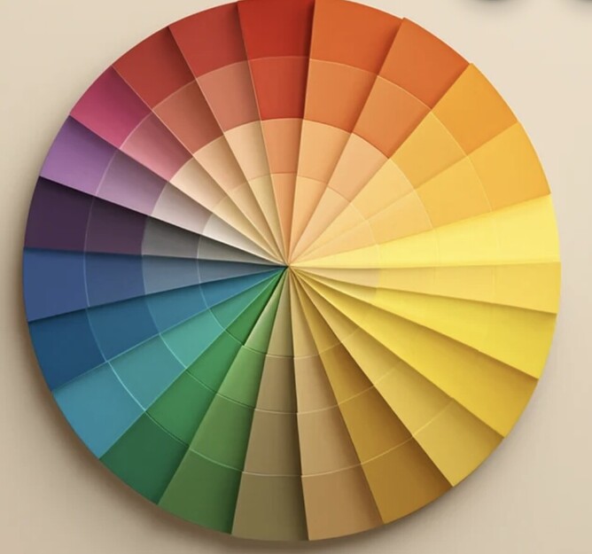
The colour wheel is divided into primary, secondary and tertiary colours.
Primary colours (red, blue and yellow) form the foundation.
Secondary colours (green, orange and purple) are created by mixing primary colours.
Tertiary colours are blends of primary and secondary colours, offering a wide range of hues.
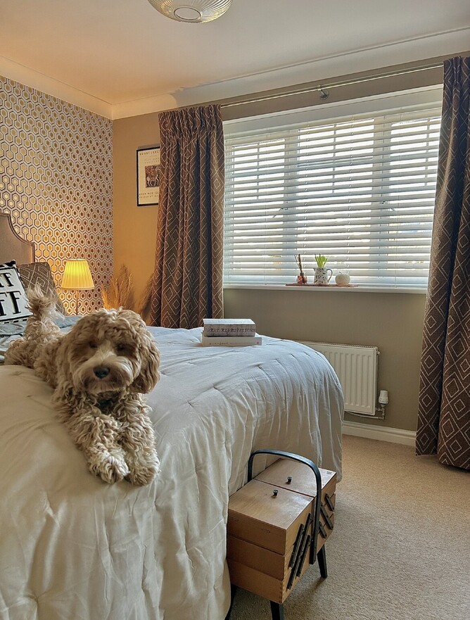
Monochromatic scheme
Different shades, tints, and tones of a single colour can add a cohesive and soothing look. As you can see above in this bedroom various shades of brown have been used to create a sense of calm. According to colour psychology, brown can give a sense of strength and reliability making you feel safe and secure.
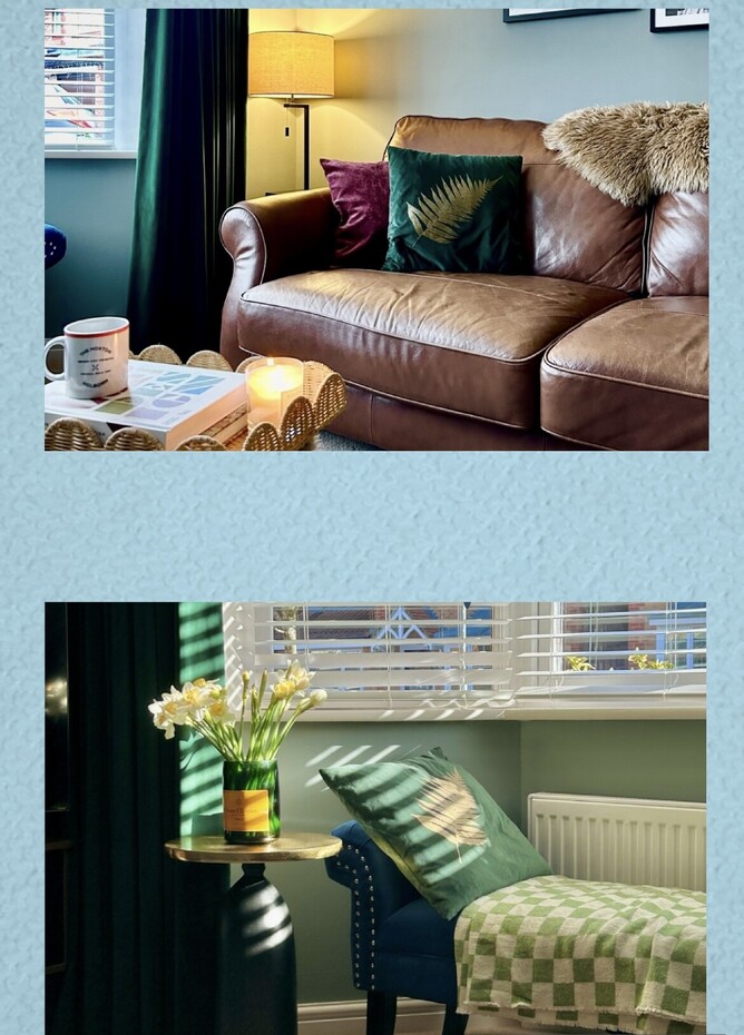
Analogous & Complimentary colour schemes
Think blue-green-pale green as in this image above, this is known as an analogous colour scheme where colours sit next to each other on the colour wheel. The top photo shows a complementary colour scheme with red and green (opposites on the colour chart). This creates a vibrant and dynamic contrast, perfect for bolding statements.
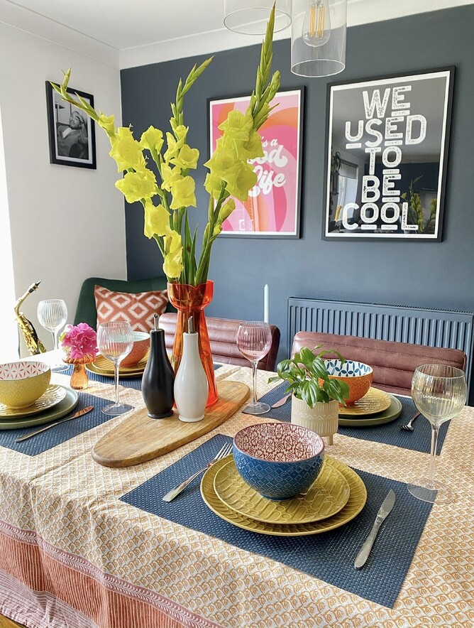
Triadic scheme
This uses three colours that are evenly spaced around the colour wheel, such as red, yellow and blue. This balance offers a vibrant and lively palette, ideal for playful and energetic spaces such as a table setting (as above).
Contrasting accessories:
The spice rack of decor

Adding colour to your home doesn't have to mean repainting every wall. Start with contrasting accessories think of them as the spice rack of decor.
Swap out dull blankets for vibrant ones, and mix some bold vases and flowers. These little pops of colour can change the room's flavour without overwhelming the pallet, remember it's all about balance - like adding just the right amount of chilli to your dish, you want to kick not a fire hazard.
If you're concerned about adding too much colour, opt for neutral walls as a calming backdrop, and then inject pops of colour through the artwork on the walls and accessories you choose. this approach allows for versatility and easy updating. For added impact use patterned flooring to create a striking wow factor. this method adds depth and interest without overwhelming the space, making your home stylish and adaptable.
Bold statement
Every room needs a bold statement piece - a flamboyant sofa, a striking piece of art, or an eye-catching rug. this is your chance to go big or go home. These pieces are like the peacocks of your deco, strutting their stuff and demanding attention. Just make sure they don't have to compete too much - let them be the show's star, not a supporting actor in a chaotic ensemble.
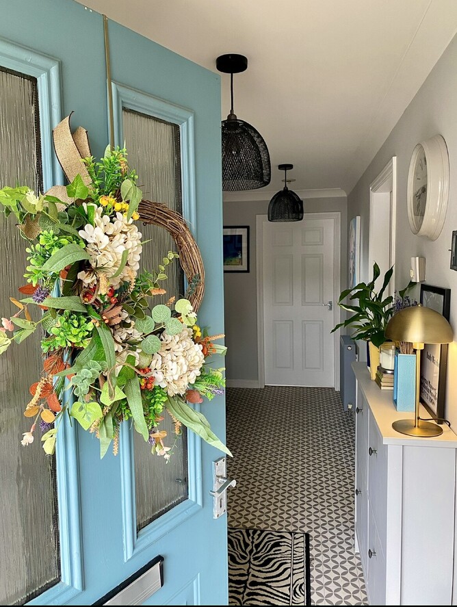
The unexpected...
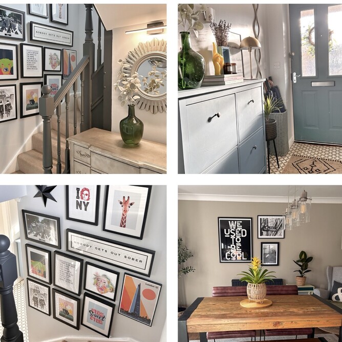
Unexpected accents are like easter eggs for your guests. Think brightly coloured doorframes, handles on furniture and Statement vases. These little surprises can make your home stand apart from others, and they're great for those "where did you get that?" moments that every interior designer lives for.
By infusing your home with these colourful touches, you'll create a vibrant, welcoming space that is uniquely yours.